|
Size: 1538
Comment: Adding logo only...
|
← Revision 19 as of 2010-10-21 22:16:45 ⇥
Size: 3318
Comment:
|
| Deletions are marked like this. | Additions are marked like this. |
| Line 1: | Line 1: |
| This is the current logo: | #pragma section-numbers 2 = Ye Olde Logo Contest = |
| Line 3: | Line 4: |
| [http://www.selenic.com/mercurial/mercurial-logo.png] | How we picked the current logo. <<TableOfContents>> == Announcement == This is the old logo: [[http://www.selenic.com/mercurial/mercurial-logo.png]] |
| Line 27: | Line 36: |
== Submissions == |
|
| Line 28: | Line 40: |
| attachment:peso_200x62.png | {{attachment:peso_200x62.png}} |
| Line 31: | Line 43: |
| || Source || attachment:peso_hg_drop.svg || | || Source || [[attachment:peso_hg_drop.svg]] || || Tool || Inkscape || ---- {{attachment:peso2_200x52.png}} The icon might look like this {{attachment:peso2_32x32.png}} || Title || Mercurial Drop || || Version|| 2 || || Author || Peer Sommerlund || || Source || [[attachment:peso2_hg_drop.svg]] || |
| Line 37: | Line 58: |
| attachment:origvect_200x200.png | {{attachment:origvect_200x200.png}} |
| Line 40: | Line 61: |
| || Source || attachment:origvect.svg || | || Source || [[attachment:origvect.svg]] || || Tool || Inkscape || || Title || Original logo vectorized using blur filter || || Author || E. Aina || || Source || [[attachment:origvectblur.svg]] || |
| Line 44: | Line 70: |
| when the h and g meld into the m of mercurial. | '''when the h and g meld into the m of mercurial'''. |
| Line 46: | Line 73: |
| attachment:hgmcl.png | {{attachment:hgmcl.png}} |
| Line 48: | Line 77: |
| attachment:mercurialmcl.png | {{attachment:mercurialmcl.png}} Some icons : {{attachment:hgicomcl24.png}} {{attachment:hgicomcl48.png}} (A bit shiny, but can be reworked) |
| Line 51: | Line 85: |
| || Source || attachment:mercurialmcl.svg || | || Source || [[attachment:mercurialmcl.svg]] || |
| Line 54: | Line 88: |
---- {{attachment:peso3_hg-bar_200x50.png}} || Title || Mercurial Bar || || Author || Peer Sommerlund || || Source || [[attachment:peso3_hg-bar.svg]] || || More images || [[http://www.assembla.com/spaces/image_annotation/image_gallery/c65E1kZRyr3iMBabIlDkbG|Assembla image gallery]] || == Winner == I've basically decided on a new logo. The submissions for the contest were interesting, but I wasn't really happy with any of them. So I enlisted the help of a designer friend and spent the last couple days with her coming up with something I was happy with. The submission I found most interesting (Peer's "drop") continued the liquid mercury theme of the original. Unfortunately, it looked rather more like an oil drop than mercury and also didn't scale well. I also really liked Jens' choice of font (Kaffesatz) and so that also appears in the final design. And here it is: {{http://selenic.com/hg-logo/logo-droplets-150.png}} http://www.selenic.com/hg-logo/ ---- CategoryHistorical |
Ye Olde Logo Contest
How we picked the current logo.
Contents
1. Announcement
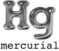
This is the old logo:
http://www.selenic.com/mercurial/mercurial-logo.png
I like it, but it's a bit small. And the "mercurial" font is crummy.
New logos should:
- be at least 2000 pixels wide for printing purposes
- look good at 100-200px width
- be adaptable to an icon
- include separate layers where appropriate (drop shadows, etc.)
- document fonts used (preferably freely available)
- look good on a t-shirt
- be available under the GPL, of course
Link submissions below this line with:
- a small-sized image
- a link to a larger image
- a link to a layered "source image" (eg Gimp XCF, SVG..)
- any other information like fonts used
- your name
I will choose a winner on Dec 25th 2007 (aka Newtonmas).
2. Submissions

Title |
Mercurial Drop |
Author |
Peer Sommerlund |
Source |
|
Tool |
Inkscape |
 The icon might look like this
Title |
Mercurial Drop |
Version |
2 |
Author |
Peer Sommerlund |
Source |
|
Tool |
Inkscape |
Not much of originality, I guess...

Title |
Original logo vectorized |
Author |
M. Clabaut |
Source |
|
Tool |
Inkscape |
Title |
Original logo vectorized using blur filter |
Author |
E. Aina |
Source |
|
Tool |
Inkscape |
when the h and g meld into the m of mercurial.
The logo only:

And with related text:

Some icons : 
 (A bit shiny, but can be reworked)
Title |
Initial try of h and g merge in m shape |
Author |
M. Clabaut |
Source |
|
Tool |
Inkscape |
Font |

Title |
Mercurial Bar |
Author |
Peer Sommerlund |
Source |
|
More images |
3. Winner
I've basically decided on a new logo. The submissions for the contest were interesting, but I wasn't really happy with any of them. So I enlisted the help of a designer friend and spent the last couple days with her coming up with something I was happy with.
The submission I found most interesting (Peer's "drop") continued the liquid mercury theme of the original. Unfortunately, it looked rather more like an oil drop than mercury and also didn't scale well. I also really liked Jens' choice of font (Kaffesatz) and so that also appears in the final design.
And here it is:

http://www.selenic.com/hg-logo/